12 Years of Fires in Sardinia
This summer I was looking for some data visualization challenges and I came across this cool project by Mauro Melis. Mauro created it for a contest organized by Open Data Sardegna, and the jury found it so cool that he won the first prize in the data visualization category.
It’s basically a scrollytelling visualization, a type of visualization popularized - among others - by The New York Times and the guys at The Pudding.
There were no links to the data that Mauro used, but it was pretty easy to find the datasets from 2005 to 2016, namely 12 years of wild fires in Sardinia.
I like scrollytelling, but I wanted to do something quick this time. I also wanted to try an online tool (it’s also a library, but I used the online tool) developed by Uber: Kepler.gl.
Shapefiles? GeoPandas!
The datasets from 2005 to 2016 contain shapefiles, a popular geospatial vector data format. I know that there are several geospatial libraries in Javascript, and of course D3 is awesome for creating maps, but I think that Python is so much better at data wrangling than Javascript, so I decided to go with it.
In Python, if you need to work with data, you pick Pandas.
If you need to work with Geospatial data, you pick GeoPandas.
It’s that simple!
Not much Data Wrangling
Turns out that these datasets were actually pretty good, so I didn’t have to do too much data wrangling. Of course there were differences from year to year, but nothing major. As an example, this is what I did to clean the 2016 dataset:
import os
import geopandas as gpd

gdf2016 = gpd.read_file(os.path.join(data_dir, 'areeIncendiatePerim2016', 'Perimetri_Superfici_Bruciate_2016.shp'))
gdf2016 = gdf2016\
    .reset_index(drop=True)\
    .drop(columns=['BASE_FID', 'ID_INCE', 'ISTAT', 'ID_PROV', 'STIR', 'STAZIONE',
                   'COMUNE', 'TIPOLOGIE', 'M2_BOSCO', 'M2_PASCOLO', 'M2_ALTRO', 'SUP_TOT_M2',
                   'TIPO_INCE', 'dist_ins', 'ID_RILIEVO', 'MODIFICHE'])\
    .rename(columns={'TOPONIMO': 'toponym', 'DATA_INCE': 'date', 'N_INCE': 'num_fires', 'SUP_TOT_HA': 'hectars'})

cols = ['toponym', 'hectars', 'date', 'num_fires', 'geometry']
gdf2016 = gdf2016[cols]
Basically I harmonized the datasets from 2005 to 2016, so they had the same structure.
gdf2016.head()
Then I concatenated everything:
gdf = pd.concat([gdf2005, gdf2006, gdf2007,
                 gdf2008, gdf2009, gdf2010,
                 gdf2011, gdf2012, gdf2013,
                 gdf2014, gdf2015, gdf2016])
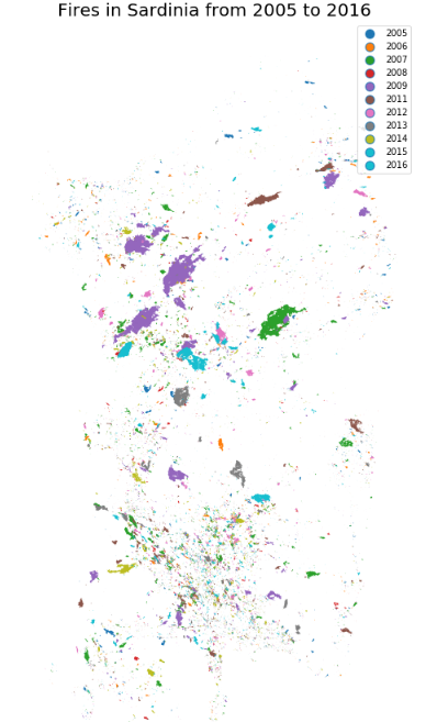
I experimented a little bit with GeoViews in a Jupyter notebook…

Simplify (after all, Less is More)
I exported everything with:
df.to_csv('sardinia_fires.csv')While this worked, it resulted in a ~150MB CSV file. This is because I was including in the output the geometries of all the polygons. I uploaded the CSV file to Kepler.gl and it actually worked (well, I wasn’t exactly surprised given that Kepler was developed to visualize Uber’s data), but it took some time (I think ~10 minutes to upload).
I explored the data in Kepler.gl for a couple of minutes. The vast majority of the wild fires in these datasets were quite small, so they looked like points. I decided to get rid of the geometry column in the GeoDataFrame and to export only the coordinates of the centroid of each polygon. This was super easy to do with GeoPandas:
gdf['CentroidLongitude'] = gdf['geometry'].apply(lambda poly: poly.centroid.bounds[0])
gdf['CentroidLatitude'] = gdf['geometry'].apply(lambda poly: poly.centroid.bounds[1])
The resulting CSV file was obviously much smaller.
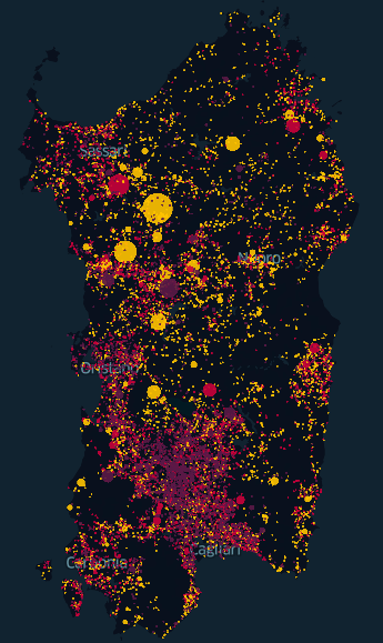
I decided to use the following visual encoding for the points (well, circles):
- color correlates with number of fires (yellow = less fires; purple = more fires)
- size correlates with area (in hectares).
Success!
I took a screenshot:

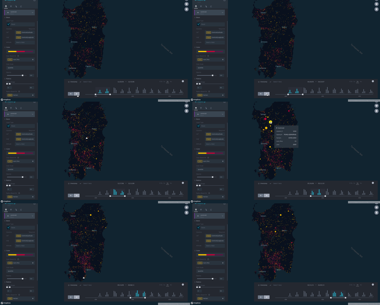
and an animated GIF (I recorded it with Peek, a really amazing tool):

I posted it on the DataIsBeautiful subreddit and it was quite succesfull.
Someone commented that I should have added a legend, and I agree, but apparently I was too lazy to find out how to add it in Kepler.gl.
Other projects where I had to do much more data wrangling had been completely ignored.
Lessons learned:
- Nobody cares about how much you struggled with data wrangling (but you still have to do it).
- Always include a GIF in a README (well, I already knew that…)
- Sardinian cities keep their Italian name in English
Code
You can find the repository on GitHub.
A Note on Reproducibilty
I recently tried to reproduce the notebook and I had to exclude the dataset from 2010. I think this is due to some dependency issues with fiona, which is used by GeoPandas.